Thursday, July 30, 2009

Assignment 6 Final Work


(click to enlarge)Posted by Picasa

Final work of the infographics. I've added some text to tell the readers what is going on at each stage. The water dam was also shifted more to the central region of each picture. The 2D house that was being criticized during the class presentation was also changed to a 3D one.

Overall did some shifting here and there to accommodate the new texts that were added. Other than that, the rest pretty much remains the same..

Assignment 5 Final Work


(click to enlarge)Posted by Picasa

Major changes for this final work. Firstly, some of the pictures of the political figures were changed. As I have to make them all into black silhouette figures, I'll need to make use of pictures that after alteration, are still recognisable.

This is crucial as being recognisable is important for me to convey the message across my target buyers. If they can't really see who the people are, then it will defeat the purpose of the postcard.


(click to enlarge)Posted by Picasa

Once again, I had gone for the brown background. This colour is appropriate to signify the large land mass of the Asian continent. Green border signifies vegetation, probably around the Southeast Asian region. Unnecessary words were also removed to reduce the clutter in the postcard. The back of the postcard remains unchanged..

Assignment 4 Final Work


(click to enlarge)Posted by Picasa

Replaced some of the texts by changing the font. I've traced the Singapore map and incorporated it with 3 different colours - white, yellow, red. The high speed tunnel on the laptop screen is oso traced and incorporated it with blue and white. This is to have some originality in my work. The rest of the poster remains unchanged.

Assignment 3 Final Work


(click to enlarge)Posted by Picasa

Nothing much is changed except that I've added some little balloons with pictures on story picture number 3. This will make the story much clearer as people will know why do I need to traffic drugs.

Assignment 2 Final Work


(click to enlarge)Posted by Picasa

Nothing is changed for this assignment. Only difference is the picture of the ATM. I've taken a new one with better lighting and contrast.

Assignment 1 Final Work


(click to enlarge)Posted by Picasa

This is the final work for assignment 1. Enlarged the sizes of the jumping track and stone so as to bring more focus to them, thus making the "WAI" look more distinct. Kangaroo is jumping now rather than juz standing stationary in the prototype. This enhances the dynamic-ness of the whole picture. Finally, added a colourful background to show that my life, though not really smooth sailing, is still a good and colourful one..

Thursday, July 23, 2009

How things work

• Description
– Choose a system and describe how it works
– Show stages of development

• Form: Infographics (Information graphics)
• Size of actual artwork: variable
• Maximum size: fit in A3
• Artwork to be used in: book, magazine, newspaper, newsletter, brochure, manual etc.
• Target audience: Readers
• Color: Full color (functional color)
=====================================


Last assignment of this short semester!! This time round it's an easier assignment in a way that it's more straight forward, it's more of a test of my ability of drawing rather than idea and creativity.

Infographics on how things work, there can be really alot alot of examples. During class, the lecturer showed us some of her works on infographics. They are about plate tectonics, tsunami, volcano n stuffs in a secondary school Geography textbook. Nice really, drawing natural formations with the right colours and conveying the right message is not easy.

Since Geography is my favourite subject, I plough through my old geo textbook in secondary school and see what ideas can I get from there. I need something which is easy to convey and easy to draw. I chanced upon the Clean Energy section mentioning about Solar Power, Wind Power and Hydroelectric Power(HEP)..

Alright, everyone's talking about Global Warming and reducing carbon footprint, then this shall be my selected topic. However, solar and wind power is a tad bit too easy to draw and there's nothing much to say, so I chose the HEP. Searched through the net to get my ideas on how to draw it effectively - clean and uncomplicated.


An infographics i got online
Something that is real
A more complicated and detailed infographics
Another real water dam

My drawing on the HEP after referencing to online materials

Not too complicated, easily understandable, clean and straight forward. I've achieved my aims, and I'm lucky it's not too hard to draw!! Spent around 5hours or so..

Feedbacks were good, except that I'll need more words to decribe the whole process and my house will be better to be 3D rather than 2D. Ok, that is all that need to be changed. Phew~!!


This is the work of Qiu Xun, who is a Science student and he drew an infographics on Manufacture of Nuclear Fission Bomb!! Haha!! That's like so unique la.. There are also other interesting works like formation of acne, NEWater making, flea market setting, make up procedure etc etc..

OK, now, I'll need to get down to work. Fine tune all my work and organise my portfolio. One last hurdle to cross.

Wednesday, July 22, 2009

Your notion of colorful Asia…

• Theme focus: …cultural, political and social aspects of Asia
• Form: Postcard (both front & back)
• Size of actual artwork: A6
• Targeted audience: Anyone who you like to introduce your view of Asia to them.
• Color:
– Front: Full color
– Back: Black, white and various shades of gray
=====================================

This is kinda tough though. Asia is such a huge continent with a mix of many different cultures, races, language etc etc. How can I convey Asian message in just one small A6 postcard? Granted those few example shown by the lecturer, I feel those are pretty one dimensional. Food, places of attraction, clothes, or tyical national monuments. Is that all we can say about Asia?

I don't want to simply focus on one country of Asia, ie. China/India/Singapore. I want a more dynamic approach, something different, something which everyone hasn't tried in the examples shown. I want my postcard to stand out rather than become just another piece of work by a student.

Eventually, I went for the brave route and chose politics, I guess nobody would wanna touch this topic since it's being perceived as "boring", "unattractive", "uninspiring" etc. But, how am I to convey political scene of Asia?

First of all, I wanna show different parts of Asia - Northern, Southern, Eastern and Western. And using each part of these regions, show a famous political figure. In addtion to that, I will try to select how these political figures differs from one another.

I end up with these people:-

Lee Kuan Yew (Singapore)
Aung San Suu Kyi (Myanmar)
Bhumibol Adulyadej (Thailand)
Mohandas Karamchand Gandhi (India)
Saddam Hussein (Iraq)
Vladimir Putin (Russia)
Mao Ze Dong (China)
Kim Jong Il (North Korea)

I managed to include different parts of Asia as well as different kind of rulings. Democracy, Dictatorship, Communism and Monarchy

It was a tough choice for China. There's Sun Yat-Sen and Deng Xiao Ping. But I chose Mao Ze Dong cos he has this gigantic portrait of him at Tiananmen Square, which is a tourist attraction. I also took away the Thailand King cos I think he isn't influential and "well known" enough outside of Asia. Using the figures, I arranged them in circle form on my postcard.

Colour Scheme thumbnails
Chosen colour design.. The brown background signifies the huge land mass of the Asia continent, n the green border to signify vegetation.
Backface of postcard


I added "This is Asia" in different languages to show the language diversity. "This is Asia, where you meet everybody" is to let the user know you can meet all sorts of people in Asia - different skin colour, different language, different political views.


Feedbacks received were kinda positive, well at least it generated more interests. Of cos, you can't satisfy everyone with one design. As I've predicted, people were asking for other political figures who are not present on the postcard. But one very crucial comment was my treatment of the figures - contrast, colouring, shading etc etc. They're not consistent, and the pictures of chosen were not uniform too - standing, face front, side profile. All these will have to be consistent. And the words in different languages, are they necessary?

I'll still need to tweak some parts here and there...

Tuesday, July 21, 2009

Talking Forms

– group activity: group of 2
– Size: A6 (per image)
– Pick 2 words from the list
– Use basic elements (dot, line, shape…) to create 2 abstract / semi‐abstract images conveying meaning of these words (1 image per word).
– Medium: Hand drawn or CG
– Submission: Upload it on your blog
=====================================


The list of words to choose from


Chosen "Slow" and "Halt" (Click to enlarge)

--Slow--
What comes into our mind when we see this word? It's kinda typical though, it's either tortoise or snail, cos everybody tend to associate these two animals as slow moving objects. But we further enhanced it with a sunset and a ticking clock.

--Halt--
Halt and stop do have a difference. Halt has this abrupt stopping effect, making the person screech to a stop. Thus, we drew something like this, a big hand showing the stop sign to give the element of surprise. The person's body language also shows that he wasn't ready to stop and had to make a last minute brake.

Wednesday, July 15, 2009

iN2015 Poster

• Content: Poster design
• Size of actual artwork: A3
• Color: full color
• Targeted audience:
– General public of Singapore
• Locations of poster:
– Bus stops
– Notice boards on busy streets
– Neighborhood & community centers

• Step 1:
– Pick an area associated to the theme, i.e. iN2015
– Write a copy (text which goes on poster) of not more than 150 words
• Step 2:
– Brainstorm: Sketch a few poster ideas (simple thumbnail sketches)
– Design the poster such that it coveys the meaning through layout (placement of visual elements ‐ photos, text, graphics elements etc)

• Objectives:
– Understanding the importance of basic visual elements and design principles in communicating a message
– Developing necessary techniques to communicate the message through form
– Application of basic visual elements and principles to capture fast, passing audience
=====================================

This one is tough, cos research has to done. I'll need to fully understand the whole iN2015 masterplan in order to be able to convey the message clearly to my audience..


1st of all, I'm gonna need a Singapore map since this is a nationwide project
\
Integrated the fibre optics picture of the globe into the SG map to show that SG is connected to the rest of the world at high speeds


I tried to tilt the map a little, but it doesn't have any extra effects, so i scrap it..

Now to the phototaking.. OMG, it was really time consuming adjusting the lightings n the position of my hands

Yes? No? RETAKE AGAIN!!

And finally, i got it right after like 30 shots??
Added the SG map

Added some special effects to enhance the speed feeling..

This is the final prototype.

U C what I C

• Visual narrative: Telling a story in 8 photos(without using words to describe your story)

• Story telling: Your story can be with or without a twist

• Media: Photography (with or without photo manipulation via software)

• Equipment: Point and shoot Camera or a good handphone camera (min. 3MP)

• Size: Approx. 3R each photo.

Step 1:
• Idea generation: Create a (few) sketchy storyboard to visualize your ideas.
• Capture a series of photographs, try out different compositions on each shot.
Step 2:
• Assess and arrange the photos
• Photo manipulation (optional) to enhance its visual communicative impact

Objectives:
• Understanding and overcoming constrains/ problems of representation
• Using photographic representation techniques to communicate your ideas effectively
=====================================

Storytelling using photos? That sounds abit easier as I don't have to draw. Let the camera do the talking!!

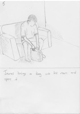
This is my rough storyboard sketch..


Posted by Picasa


Posted by Picasa


The actual photo taking


Posted by Picasa

What I was trying to do is to add more drama into the story, cos I guess alot people are gonna do the story twist. Well, if u consider the CNB officers disguised as drug buyers as a twist, it's fine too.

Feedbacks received wasn't that gd, cos it seems that there must be a "moral of the story" if there isn't a twist in it. The moral? "Don't borrow from loan shark", "Don't gamble in stock market", "Don't borrow money which you can't repay".

My pictures didn't fully convey the story. Think that's the problem when I try to be dramatic. There's too much to tell. And with the restriction of not using words, it's a little tough.

Perhaps I should have added a picture like this?

Haha, I think this will say a lot rite?

There's still some tweaking to do for sure..